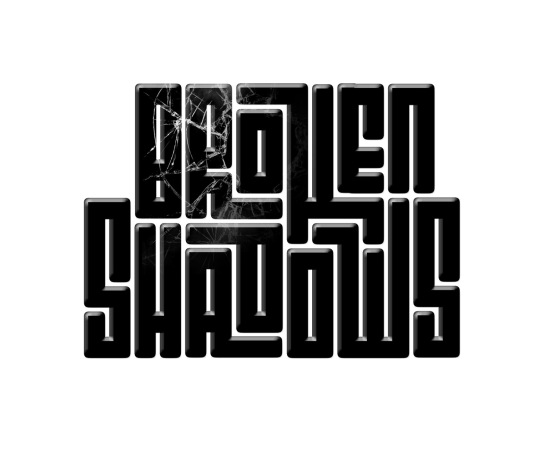
As mentioned earlier, I was happy to be part of the team bringing Broken Shadows to the light (pun intended)
I wanted a touch of geometric symmetry of Square Kufi and to try using it in Lain Alphabet. My target was to present something more sophisticated than a normal font and of course that the design is tailored specifically to the title, while maintaining the appeal to an international audience.
And it all begins with the pen and paper.
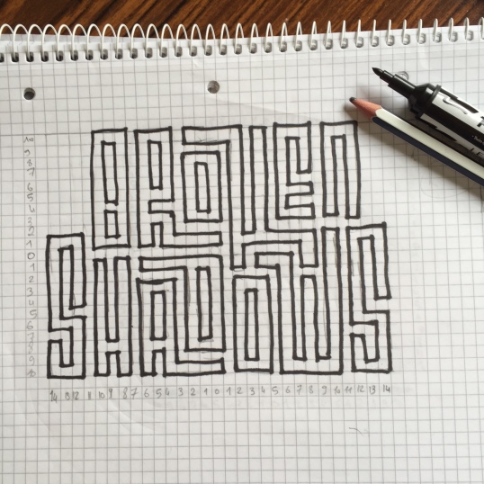
And then it turns out into this:

u062au0648u0636u06ccu062d u062eu0648u0628u06cc u0628u0648u062f.u0648u0627u0642u0639u0627 u0645u0645u0646u0648u0646u0645.u0627u06afu0631 u0645u0645u06a Click https://twitter.com/moooker1